Controlling Quality: The Role of Control Charts in Six Sigma
Learn how control charts enhance quality in Six Sigma by tracking process performance, spotting variations, and supporting data-driven improvements

In the world of quality management, ensuring consistent and high standards is critical for business success. One of the key tools that help organizations achieve this is the control chart. Widely used in Six Sigma methodologies, control charts are more than just graphs—they are powerful diagnostic tools that help identify variations in processes, guiding companies toward continuous improvement.
What Are Control Charts?
A control chart is a statistical tool used to monitor and control a process over time. It displays data in a graphical format, showing how a process performs relative to its expected performance. By plotting data points against predetermined control limits, businesses can quickly identify when a process is out of control and requires intervention.
The concept of control charts was developed by Walter A. Shewhart in the 1920s, revolutionizing quality control by providing a scientific approach to process monitoring. Control charts have since become integral to Six Sigma, Lean, and Total Quality Management (TQM) methodologies.
The Six Sigma Connection
Six Sigma, a methodology focused on reducing defects and improving process efficiency, relies heavily on control charts. Control charts play a pivotal role in reaching this goal by
-
Detecting Variations: They distinguish between common cause variations (natural fluctuations in any process) and special cause variations (unexpected issues that need immediate attention).
-
Guiding Decisions: Control charts provide data-driven insights, helping teams make informed decisions about process adjustments.
-
Tracking Improvement Over Time: They help monitor the effectiveness of process changes, ensuring improvements are sustained.
Types of Control Charts
Different types of control charts are used based on the nature of the data and the type of process being monitored. Understanding which chart to use is crucial for accurate analysis.
-
X-bar and R Chart:
-
Purpose: Monitors the average and range of variable data in processes with subgroups (e.g., batch production).
-
When to Use: Suitable for small sample sizes (typically 4-5 units per subgroup).
-
Example: Monitoring the diameter of metal rods produced in a factory, where measurements are taken from multiple rods in each batch.
-
X-bar and S Chart:
-
Purpose: Similar to the X-bar and R chart, but uses the standard deviation instead of the range to measure variability.
-
When to Use: Ideal for larger sample sizes (n > 10), where standard deviation provides more accurate data.
-
Example: Tracking the weight consistency of packaged food items, where larger sample sizes are feasible.
-
p Chart (Proportion Chart):
-
Purpose: Tracks the proportion of defective items in a sample.
-
When to Use: Best for attribute data where the outcome is binary—either defective or non-defective.
-
Example: Monitoring the percentage of faulty light bulbs in a production line.
-
C Chart (Count Chart):
-
Purpose: Counts the number of defects per unit, applicable when multiple defects can occur within the same item.
-
When to Use: Suitable for counting defects in items where defects are not limited to a single occurrence.
-
Example: Counting the number of scratches on smartphone screens during quality checks.
-
U Chart (Defects per Unit Chart):
-
Purpose: Similar to the c-chart, but used when the sample size varies from one batch to another.
-
When to Use: Best for processes with fluctuating production volumes.
-
Example: Tracking the number of errors in customer service call logs, where the number of calls may vary daily.
Key Components of a Control Chart
Understanding the key components of a control chart is essential for interpreting the data accurately:
-
Center Line (CL): Represents the average or expected performance of the process. It serves as the baseline against which variations are measured.
-
Upper Control Limit (UCL) and Lower Control Limit (LCL): These thresholds define the range within which the process is considered stable. Data points outside these limits signal potential problems.
-
Data Points: Represent actual process performance over time. They are plotted in chronological order to identify trends, shifts, or outliers.
-
Control Limits vs. Specification Limits: While control limits are based on statistical calculations, specification limits are set by customer requirements or industry standards. A process can be in control but still produce products that don’t meet customer specifications.

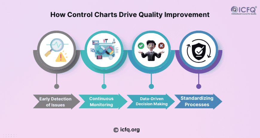
How Control Charts Drive Quality Improvement
-
Early Detection of Issues:
Control charts help detect trends and shifts in data before they result in significant quality issues. For example, if a manufacturing process starts producing items slightly out of specification, the control chart will highlight this trend early, allowing for corrective actions before defects become widespread. -
Continuous Monitoring:
Unlike periodic quality inspections, control charts provide continuous, real-time monitoring. This proactive approach helps maintain consistent quality rather than relying solely on post-production checks. -
Data-Driven Decision Making:
Control charts remove guesswork from quality management. Decisions about process changes are based on factual evidence, reducing the risk of subjective judgments leading to ineffective solutions. -
Standardizing Processes:
By identifying the best practices that lead to stable processes, control charts help standardize operations across teams and shifts, ensuring consistent performance throughout the organization.
Real-World Application
Consider a manufacturing company producing electronic components. Using control charts, the quality control team notices an upward trend in the defect rate. This early warning allows them to investigate the production line, identify a faulty machine, and correct the issue before it results in significant product recalls.
Another example is in the healthcare sector. Hospitals use control charts to monitor patient wait times in emergency rooms. By identifying trends and variations, hospital administrators can make data-driven decisions to optimize staffing levels and reduce patient wait times.
Common Mistakes When Using Control Charts
While control charts are powerful, improper use can lead to misleading conclusions:
-
Misinterpreting Random Fluctuations: Not every data point outside control limits indicates a problem. Sometimes, variations occur naturally, especially in complex systems.
-
Ignoring the Context: Control charts should be used alongside other quality tools. Relying solely on them without understanding the process can lead to incorrect conclusions.
-
Neglecting to Update Control Limits: As processes improve, control limits should be recalculated to reflect the new baseline performance.
Control charts are essential tools for managing quality and promoting ongoing improvement in any organization. They turn simple data into useful insights, helping businesses keep their processes consistent and reduce mistakes. By using control charts effectively, companies can improve the quality of their products or services, make customers happier, and run their operations more efficiently.


